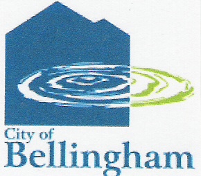
I read that Bellingham's new logo has been scrapped. It got lots of flack from citizens. Now it looks like the old mayor might be remembered for the logo fiasco. Kind of too bad as he wasn't that bad a mayor. Good on pedestrian and bike issues.
Problem with the logo is that it was too "professional." Tried to boil Bellingham down into a simple design. Slick design elements. This isn't easy to do. Bellingham is a very eclectic city and doesn't lend itself to one theme.
Maybe a place like Ashland, Oregon, famous for the Shakespeare Festival, could have a unifying theme, but Bellingham?
What would it be?
Mount Baker? the waterfront? the university? the folk music scene? Walmart? the freeway? Old Fairhaven? retired folks? students? tourists? greenways?
Or maybe just some simple design elements that don't really reflect any city in particular. That's the problem. It was too professional. With "professional" comes the price tag. $25,000, or so.
Too professional and clean.
The blue shapes in the background were supposed to represent mountains. Maybe the lines were too straight, too clean. They did look like buildings with consistent 45 degree roof lines. People kept saying they looked like condominium towers with a puddle in front. Mountains would be jagged, fuzzy, foggy, furry. With trees, holes, gaps, uneven.
One hears the term "fractals" when trying to get a computer to represent something natural like a mountain. Throw in the random element.
That's eclectic.
Anyway, it's now "water under the bridge." So much for imposing the concept of "branding" on our eclectic world.

No comments:
Post a Comment